
CarExpert.com.au
Model range deep-dive: Mahindra's SUV family
4 Days Ago

Journalist
Redesigned logos are in vogue, and Renault isn’t going to be left behind.
While crosstown rival Peugeot’s new design is a dramatic break with the past 45 years, Renault’s is a more familiar iteration.
The new design retains the diamond – or lozenge – shape the company has employed since 1925, but adds intricacy via a series of interlocking lines, and bears more than passing resemblance to the badge introduced in 1972.
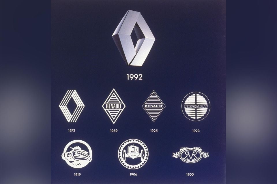
In addition to this, the new logo has ditched 3D surfacing for a flat look. This not only follows the current design trend, but also allows the badge to be illuminated, as well as neatly hide a radar unit.
“It is a balance between recognition of the brand’s heritage and entering a new era, symbol of the future,” Giles Vidal, Renault’s design boss, explained in a prepared statement.
“We have rethought it to become more iconic, simple and meaningful, a true timeless signature, without superfluous effects or colours, with a contemporary takeover of the lines, an essential part of our graphic heritage.”
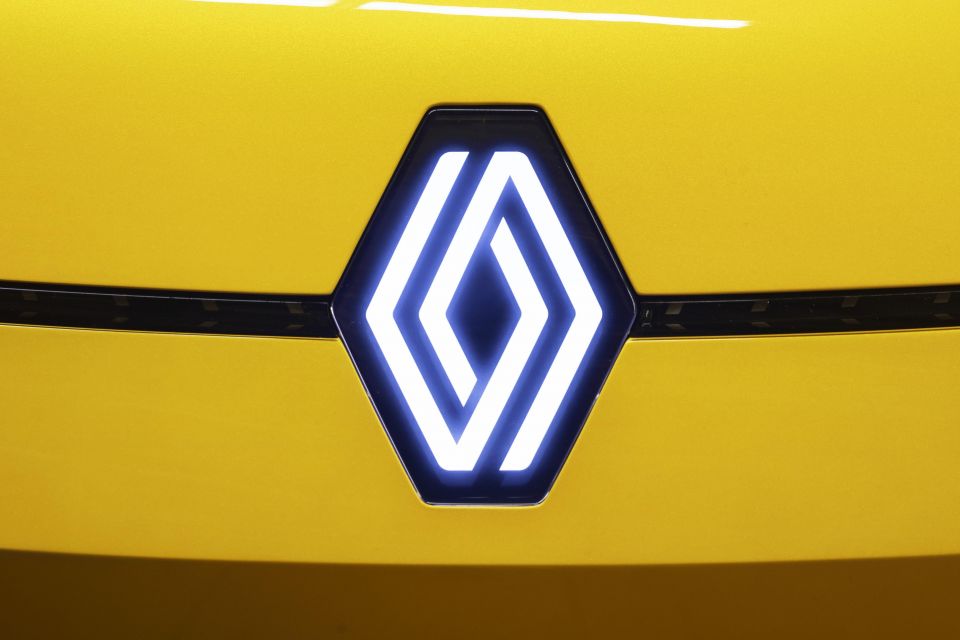
The new logo was given its first outing on the Renault 5 concept unveiled last month as part of the company’s ‘Renaulution’ turnaround plan.
According to Vidal, the design was put on the 5 Prototype as a “testing ground, and thanks to “the enthusiasm and the very positive feedback we received about the logo, we decided to launch it”.
The new logo is the ninth in the automaker’s history, with the last redesign occurring in 2015.
It will rolled out slowly across the company’s line of cars – likely as they are facelifted or enter a new generation – with the transition expected to be completed by 2024.
Where expert car reviews meet expert car buying – CarExpert gives you trusted advice, personalised service and real savings on your next new car.
Derek Fung would love to tell you about his multiple degrees, but he's too busy writing up some news right now. In his spare time Derek loves chasing automotive rabbits down the hole. Based in New York, New York, Derek loves to travel and is very much a window not an aisle person.


CarExpert.com.au
4 Days Ago

William Stopford
4 Days Ago

Max Davies
3 Days Ago

Josh Nevett
2 Days Ago

Andrew Maclean
1 Day Ago

Shane O'Donoghue
22 Hours Ago