
Matt Campbell
2025 Porsche 911 Carrera T review
6 Days Ago

Journalist
Peugeot has gone back to the future for its new logo, which features a roaring lion’s head inside a coat of arms with the company’s name across on top.
The automaker says the new identity was “developed around the concept of ‘time’ and living in the moment”, and the logo “needed to change to crown the brand’s move upmarket”.
It usher in the brand’s “bold electrification strategy” that will see each model feature at least one electrified variant by 2025.
The first car to use the company’s new lion design will be the next-generation 308, which is expected to be launched in March.
The new branding is already present on the company’s redesigned websites, and will flow through to cars and dealerships over the next few years.
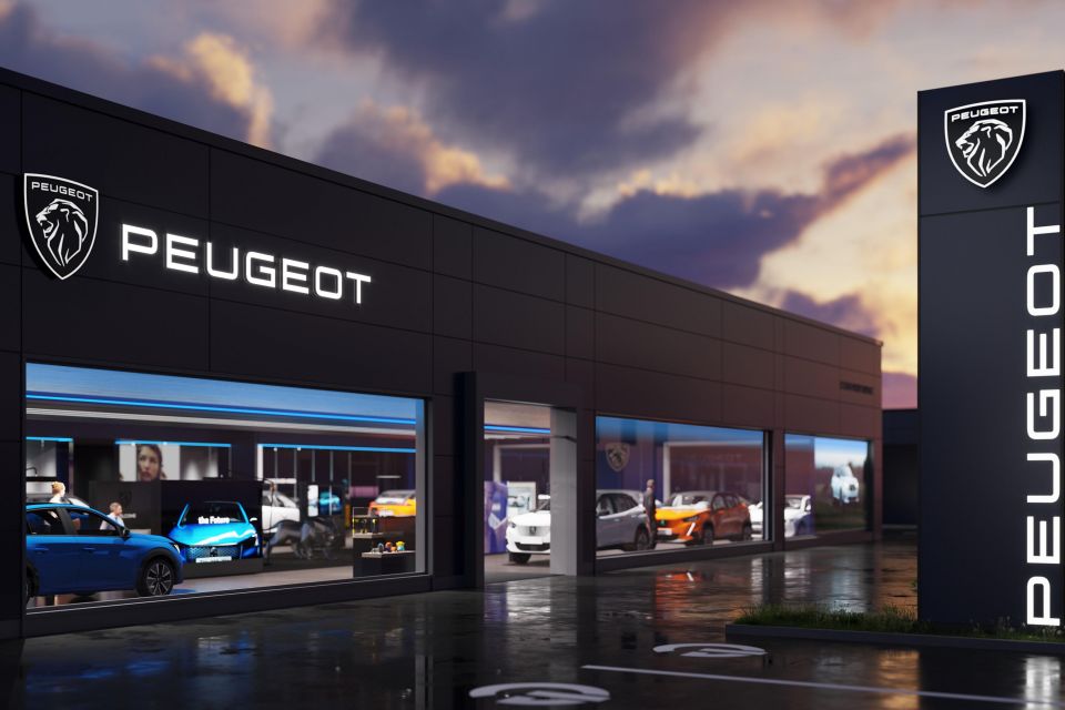
Linda Jackson, CEO of the Peugeot brand, told reporters development of the new logo and identity has been under way “since before we even started thinking about Stellantis”.
Notably the company used a 1960s-style badge on its 2018 e-Legend concept coupe, well before the merger between the PSA Group and Fiat Chrysler was announced in late 2019.
While the Peugeot family began their steel business in 1810, it wasn’t until 1847 the firm introduced its first logo: a lion perched on an arrow. Since then the company has always used the big cat as part of its brand identity.
The heraldic standing lion pose was introduced in 1948, but was replaced in 1960 by a roaring lion’s head inside a shield, the design most similar today’s redesign.
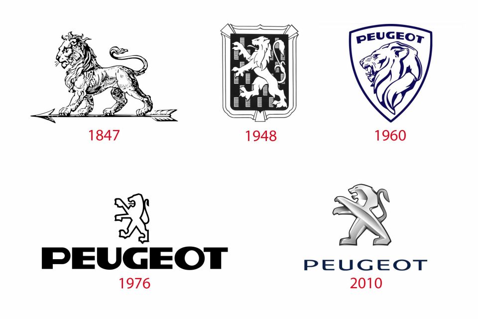
Sixteen years later the classic standing lion that most of us are used to was introduced.
Although the basics have remained the same, this logo has been updated three times, with successive iterations featuring extra 3D effects.
Where expert car reviews meet expert car buying – CarExpert gives you trusted advice, personalised service and real savings on your next new car.
Derek Fung would love to tell you about his multiple degrees, but he's too busy writing up some news right now. In his spare time Derek loves chasing automotive rabbits down the hole. Based in New York, New York, Derek loves to travel and is very much a window not an aisle person.


Matt Campbell
6 Days Ago

James Wong
5 Days Ago

Max Davies
3 Days Ago

Josh Nevett
3 Days Ago

Josh Nevett
2 Days Ago

Paul Maric
22 Hours Ago