
Andrew Maclean
MG IM5 vs Tesla Model 3: Spec battle
1 Hour Ago
When your mate picks you up in their new car, it’s common courtesy to compliment the vehicle. When it comes to the Velar it’s genuine – and that’s before the massage.


Tech Contributor
New from
$81,647
excl. on-roads

Tech Contributor
New from
$81,647
excl. on-roads


Tech Contributor
New from
$81,647
excl. on-roads

Tech Contributor
New from
$81,647
excl. on-roads
Quickly see how this car stacks up against its competition. Select any benchmark to see more details.
Where expert car reviews meet expert car buying – CarExpert gives you trusted advice, personalised service and real savings on your next new car.
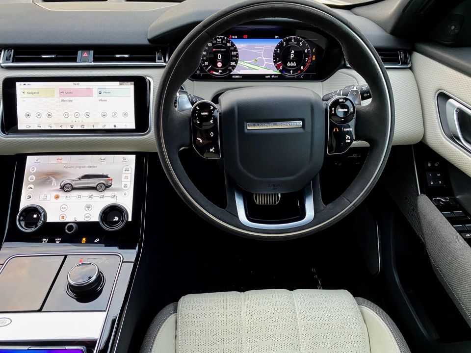
The Jaguar and Land Rover range has an infotainment system and configuration called InControl Touch Pro Duo which leaves a sensational first impression.
The main 10-inch display tilts forward when the car is powered on, and a second 10-inch display beneath it providing further options with physical dials and a line of digital keys below that.
The instrument cluster is a third display, while the controls on the steering wheel are touch-based. We had the chance to test this system out in the Range Rover Velar.
The centre console houses a dial for the transmission, and after a few days we discovered next to it is a cup holder revealed by pressing the Land Rover button. This is strange because a very obvious cup holder sits behind it.
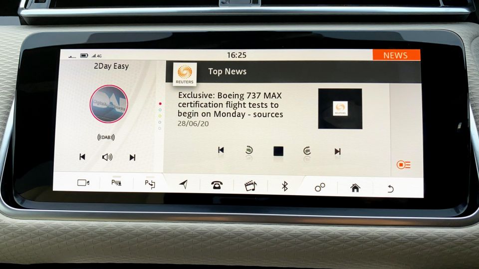
Maybe it’s just a safe compartment for prized possessions. Inside the centre console you’ll find two USB ports, a micro sim slot for mobile data, and a 12V socket.
Those in the back are left with a 12V socket but no USB ports. The Velar has Wi-Fi, and you can connect it to your smartphone if you need the car to be internet connected, but we’d suggest a 12-month prepaid SIM you leave in the car is a better option.
The two central displays can be customised heavily. One immediate change was the ability to change the black background to white so it blends in with the plush white interior of our Velar.
The pattern on the dashboard continued on the white infotainment wallpaper, which shows how much Land Rover has thought about the screen’s implementation.
The Velar supports Apple CarPlay and Android Auto, but you’re unlikely to want to do that immediately. You’ll find access to DAB, FM and AM functions in the Velar, as well as Bluetooth connectivity.
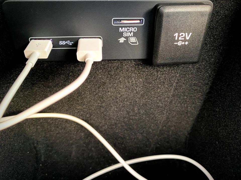
Music, podcasts, and audiobooks all sound excellent thanks to the Meridian sound system in the Velar. The media section also opens up the opportunity to make use of the data connection and catch up on the latest updates from CNN or Reuters.
This is really handy when you get into the car and you’ve missed the news. A quick tap and you can get your sports, weather, world news and more. In the same section you can also track your flight, as if Range Rover assumed all Velar owners are jet setters.
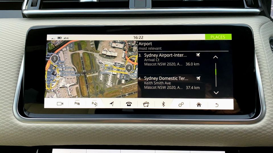
You’ll also find access to a web browser which is fine if you have no other option available.
The main screen is split into sections allowing you to see a live feed of news headlines, the weather, or your music while you interact with other windows.
The maps and navigation str powered by HERE, which is a very good thing. Their mapping is excellent and allows satellite views which are of a high quality and will also overlay live traffic. Navigation is naturally viewable on the main display or your instrument cluster.
The instrument cluster can be configured to hide the digital dials and show a full screen view of your navigation, leaving a small strip of speed and fuel data at the bottom.
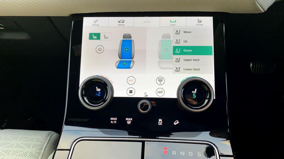
The second display is mainly focused on adjusting your air conditioning and drive mode. Once you learn how to use the menus – and there can be a lot to dig through – you’ll find some impressive controls.
The seats in the Range Rover Velar we tested were heated and cooled, meaning your back could be warm and bottom cool or vice versa. You could enable massaging for the driver and passenger of various kinds – wave was our favourite, and was excellent for arriving nice and relaxed after long journeys.
In the second display you’ll also find controls to modify the colours of the interior lighting, how aggressive the air-conditioning is, and air purification settings. No wonder the Royals enjoy these cars.
The dials to control the air-conditioning and seat cooling/heating change based on what section of the menu you’re in. They also act as a toggle for functions such as on/off, and are more intuitive than we expected.
Beneath the screen are four capacitative buttons that somehow slipped off the screen: max A/C, max ventilation, traction control, and hill descent control.
We don’t understand why they are independent, and found much harder to activate or deactivate. Long press, short press, hard press, we tried them all. Eventually they work, but all four could have simply been part of the touchscreen interface.
The Velar has assisted parking and 360-degree cameras. In our experience of parking (with assistance and without) we felt like we could have been driving a Mini.
When visibility from the cameras is so good it’s hard to go wrong, even at night. The rear camera quality kept us in the car and stationary at one point as we watched the sunset behind us. The cameras showing your wheel near the kerb will ensure you keep those rims looking as the maker intended.
The steering wheel controls have a nice layout, and are well presented. The controls actually change depending on what you were doing. If you’re in the menus the left side allows you to navigate the settings, once back into your music you’ll see volume and track controls again.
The volume controls are positioned in a way that we’d often skip a track or open the menu by accident rather than turning the volume up, though.
It took some getting used to, and we’re glad there’s a volume dial in the centre console when it gets too frustrating.
There’s also a diamond key which can be assigned a task such as navigating home, and we loved the option to customise a steering function. Voice controls were also very handy, and could understand our commands well.
Finally, and the most impressive part here is the smartphone integration. Apple CarPlay and Android Auto both look great on the display. You can have CarPlay on one screen showing Google Maps, while controlling music on the lower screen.
It was good to see smartphone integration wasn’t an afterthought, it fits in nicely. It’s a handy way to access your music and podcasts, but for the first time we didn’t want to see it. The infotainment system from Jaguar Land Rover should be what you use.
The navigation is excellent and the overall design of the infotainment system blends into the car so well. It is elegant, requires some learning and understanding, but rewards those who do make the effort.
Where expert car reviews meet expert car buying – CarExpert gives you trusted advice, personalised service and real savings on your next new car.


Andrew Maclean
1 Hour Ago

Derek Fung
1 Hour Ago

Andrew Maclean
1 Hour Ago

Ben Zachariah
23 Hours Ago

William Stopford
1 Day Ago

Derek Fung
1 Day Ago